Interior lighting basics: how to light a room properly
Key Takeaways
- Good lighting is built in layers — ambient, task and accent — never a single ceiling source.
- Colour temperature is chosen by mood and use: warm, neutral or cool, expressed in Kelvin.
- Placement and control (dimmers, LED) matter as much as power: less eye strain, less energy.
- In a bespoke project, light is planned with the furniture: niches, plinths and integrated strips make the difference.
Lighting is one of the simplest and most decisive levers in a successful interior — and one of the most often overlooked when a space is being fitted out. A badly lit room feels smaller, colder and darker than it really is, while a considered scheme transforms the same space without moving a single wall. The good news is that the basic rules are few and easy to remember. They come down to three ideas: combine several light sources rather than one, choose the right colour temperature for the mood, and place each light according to how the room is actually used. This guide walks through those principles in a Swiss context, mindful of the local emphasis on energy-efficient LED lighting and of how light can slip naturally into bespoke cabinetry, from kitchens to wardrobes and built-in shelving.
The three layers of light
The first rule, and by far the most useful, is simply this: layer. A comfortable room is almost never served by a single central ceiling fitting that flattens everything in uniform light. Think of three complementary layers. Ambient (or general) light fills the whole room — a diffusing ceiling fitting, an indirect scheme that bounces light off the ceiling, or a run of downlights. Task light accompanies a precise activity — cooking on a worktop, reading in an armchair, applying make-up at a mirror, working at a desk. Accent light draws the eye to something specific: a painting, a material, a bookcase, a section of wall. A room where you work, dine and entertain therefore naturally needs several kinds of light, and it is the combination — not the wattage — that creates ease. For each room ask a simple question: what do we do here most often? That activity tells you which layers should dominate.
Colour temperature: choosing in Kelvin
Colour temperature decides whether light looks warm, neutral or cool, and it is measured in kelvins (K). The lower the figure, the more golden and enveloping the light; as it climbs, the light becomes whiter and then bluer, closer to daylight. In practice three families are useful in the home. Low values, around 2700 K, give a warm, cosy light ideal for bedrooms, living rooms and dining areas where you want a calming mood. Mid-values, from 3500 to 4000 K, offer a neutral white appreciated in kitchens, bathrooms and studies, where colour accuracy matters. High values, over 5000 K, reproduce a cool light close to full daylight, best reserved for highly technical work spaces. The practical rule is simple: the more a room is meant for relaxation, the lower the temperature. A common mistake is to use the same bulb everywhere — often too cool — which washes the whole home in a flat, dreary tone. Varying the temperature between rooms, and sometimes within a room, is enough to add depth.
Placement: design the light before you run the cable
Placement matters as much as colour temperature. A few reference points avoid the classic mistakes: light above work surfaces, never behind the user (that throws your own shadow onto the task); use wall lights or floor lamps in lounging corners rather than a single ceiling fitting; and avoid direct glare by aiming sources away from the eye or shielding them. Heights are reasoned against the furniture and worktops rather than in the abstract. In a bespoke kitchen, for example, an under-cabinet strip lights the worktop without shadows; in a built-in wardrobe or bookcase, a linear light at the base of each bay makes the content readable at a glance. Dimmers add invaluable flexibility: they let you match the light to the time of day and the task while wasting very little energy. Before drilling or wiring, stand where you will actually live:
- Light worktops and desks from above and slightly in front of the surface, never into your own neck.
- Keep low, warm light for relaxing zones and cool, precise light for working zones.
- Add wall lights and accent points to avoid direct glare rather than one central source.
- Put dimmers on the main circuits so you can tune the mood through the day.
Energy and LED: lighting done wisely
The Swiss context pushes toward economical lighting, and LED is the natural answer: long life, low energy use and precise colour-temperature control. Households undertaking renovation gradually replace older sources with good-quality LEDs with careful colour rendering — a criterion too often ignored but one that changes how materials, wood especially, are perceived. Led consumption figures are modest, but intensity choices and the number of points should be sized to use rather than to flood the whole room. In practice a properly layered room often consumes less than feared, precisely because you can switch on only the layer you need. That measured approach sits comfortably with the renovation and maintenance guidance circulated in Switzerland, where lighting quality is recognised as part of housing comfort alongside the surface and construction standards tracked by the housing statistics.
The best light is not the brightest; it is the one that follows the use — you rarely light a whole room, you light a scene, a task, a moment.
Building light into bespoke cabinetry
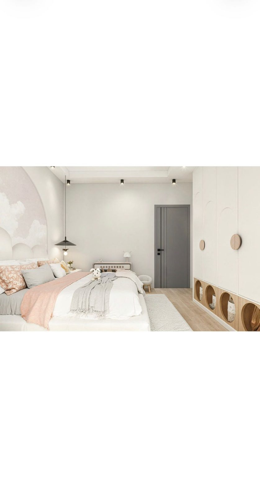
It is in a bespoke project that lighting becomes truly powerful, because it is planned with the furniture rather than bolted on afterwards. An integrated kitchen makes room for under-cabinet strips, cornice lighting above vertical faces and recessed points in islands. A wardrobe gains linear lighting triggered when the doors open, showing shelf contents clearly. A wall library accepts slim light profiles set into the underside of each shelf, showing off books and solid wood. Panels and finishes enter the picture: light surfaces bounce light and soften a scheme, while dark materials absorb it and call for better-placed or slightly denser sources. Settling these decisions early avoids temporary cabling and costly rework. A few points to resolve before the workshop starts:
- Agree with the designer where strips, cornices and integrated lights sit within the furniture plan.
- Choose discreet, accessible LED profiles so maintenance and replacement stay simple.
- Think about finish colours: light to reflect light, dark to create a targeted contrast.
- Plan the supply runs during production, not after installation.
These simple principles — layer the sources, choose the temperature, place by use and plan with the furniture — are enough to transform an interior without a disproportionate outlay. They rest on widely documented reference points in Switzerland: the renovation and housing-care good practice gathered on the Hausinfo portal, the housing data of the Swiss Federal Statistical Office (OFS/BFS), which underline how strict Swiss construction and surface standards are, and Egger's materials resources, useful for understanding how panels and finishes read under light. Useful bearings for lighting your next project with confidence.
Planning a fit-out and want the lighting designed with the furniture rather than added afterwards? Message us on WhatsApp at +41 79 888 47 73: we will advise on placement and colour temperature and build the lighting straight into your bespoke plans. Handcrafted in Switzerland.